Maps are probably the oldest type of geographical visualisation. For me, old maps are always interesting and are often works of art rather than a functional representation of space. Here are some links to online historic map collections:
By animating the text a message becomes both clearer and, more importantly, incredibly powerful. The classic examples include scenes from films (Pulp Fiction and Devil's Advocate - warning strong language).
As well as more popular uses, a number of animations have emerged with a more normative goal:
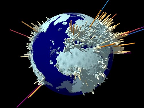
G-Econ (Geographically based Economic data) is a Yale project mapping the location of economic activity.
Using economic data for each 1 degree by 1 degree square of the Earth's surface they have created a series of globes highlighting economic activity across the world.
Word clouds are all the rage at the moment. They are simple visualisation of word frequency in a given sample of text. Wordle.net allows you to create your own. Their most popular current use is to analysis the US presidential debates. This is presumably to replace political commentators.
The above word cloud of Chapter 1 of Capital; one can clearly see Marx's major themes. Which makes you wonder what a word cloud of an interview transcript, an essay, or a journal article might reveal...
Chris Jordan is an American photographer concerned with consumption. His latest work is a series of portraits of mass consumption in the US using digital photography techniques. He explains some of his work in this video.
The image below is a photograph measuring 1.5m x 2.5m, and shows the number of disposable hot-beverage paper cups used in the US every fifteen minutes, a staggering 410,000!
Walmart: This animation maps the growth of the world's largest retailer. To reiterate the point, this visualisation measures the acreage it, and other well known retailers, covers. According to the chart, collectively Walmart stores would more than cover Manhattan.
Tim Graham, a fellow blogger, is currently keeping statistics on everything he consumes (now there's an interesting dissertation topic). You can read how is getting on on his site. He's turned the data into some interesting visuals, such as his attempts to give up Coca-cola:
Oil resources and consumption
This image from the Economist depicts global oil consumption.
The above picture, showing the make up of world greenhouse gas emissions, is taken from the World Resources Institute's Climate Analysis Indicators Tool site. There you'll find a variety of images relating to greenhouse gas emissions.
London Air is a project run by the Environmental Research Group at Kings College London. It is full of plotting air quality data for Greater London. As well as reports and news items, there are a series of statistical and graphing tools that let you customise their data. There is also some maps, of which the 3D one is a highlight.
MapEcos (left) is an interactive map of US facilities and their pollution levels. It is searchable by name, industry, owner, type of emissions, level of emissions and hazard level. The site is optimised for Firefox and IE users.
As academics presenting is a major part of what we do. Whether it is research ideas in proposals, findings in journals, or theories and concepts in lectures, presenting is our bread and butter. Most of us can recall a dull conference presentation or boring lecture we've been to, and are probably guilty of doing the same ourselves. It isn't hard to highlight reasons behind a bad presentation or to come up with measures to improve things. However, there comes a point where it is difficult to move beyond a limited set of formats and we need some inspiration. Fortunately, help is at hand, and comes in the form of Presentation Zen by Garr Reynolds. This is a brilliant blog about the art of making visual presentations. Some useful highlights include:
There is also an interesting piece based on the insights of Ira Glass, a US radio broadcaster. Here is Ira taking about story telling using anecdotes; a potentially useful way to describe the emergence of new concepts to undergraduates...
Sharing presentations and gaining feedback
As we all know feedback is a useful way to spur improvement. SlideShare is a website designed to allow you to share and again feedback on presentations. There is even an Education & E-Learning group for discussion of what works and what doesn't.
Exemplar
Hans Rosling, Professor of International Health at Karolinska Institutet and Director of Gapminder Foundation, Stockholm, Sweden, is becoming a bit of a cult figure amongst visualisation bloggers. In 2006 he made a presentation at the TED (Technology Entertainment Design) conference in Monterey, California, on new ways to present statistics about uneven development. This is his talk:
Parts 2 and 3 are available on YouTube. More details of his work can be found at the Gap Minder website.


